Creating Graphs in After Effects: Unleash the Power of Data Visualization
Introduction – Unleashing the Power of Data Visualization in After Effects
In today’s digital age, presenting data in an engaging and visually appealing way is more important than ever. To truly engage your audience, you need a dynamic tool that incorporates creativity and functionality seamlessly. Enter After Effects. Renowned for its extensive visual effects capabilities, this powerful software is also an incredible tool for data visualization.
Creating graphs in After Effects allows you to transform dull numbers and statistics into visually striking representations that effectively communicate your message. From bar graphs to line charts, pie charts to scatter plots, the possibilities are endless when it comes to crafting captivating visuals that make an impact.
In this article, we will take you through a step-by-step guide on how to create stunning graphs in After Effects. Whether you’re a beginner eager to explore the realm of data visualization or an experienced designer looking to enhance your skillset, this comprehensive tutorial will equip you with the knowledge and techniques to bring your data to life.
Join us as we explore the various tools and features that After Effects offers to create visually compelling graphs. Get ready to unleash your creativity and transform your data into captivating visuals that will engage and inform your audience like never before. Let’s dive in!
Step-by-Step Guide: Creating Stunning Graphs in After Effects
When it comes to making graphs in After Effects, there are several key steps to follow. We’ll walk you through the process, from creating a solid foundation to adding the finishing touches. So, let’s dive in and transform your data into captivating visuals!
1. Prepare Your Data:
Before jumping into After Effects, it’s important to organize your data effectively. Create a spreadsheet or document that clearly outlines the values and labels you want to showcase in your graph. Ensure your data is accurate and easily accessible.

2. Set Up a Composition:
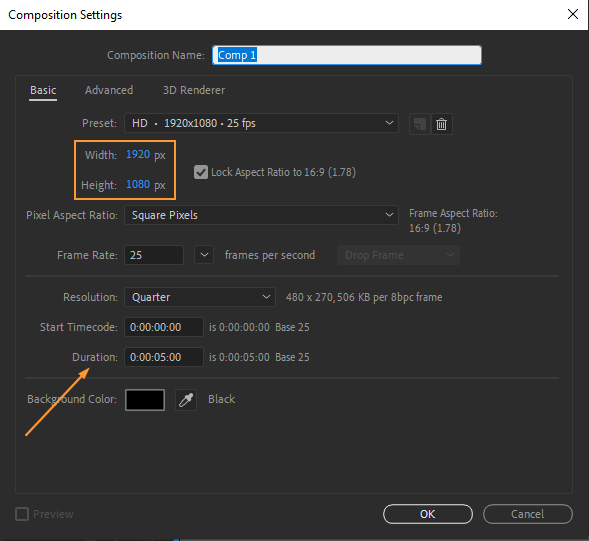
Launch After Effects and create a new composition. Set the desired dimensions for your graph, ensuring it fits the size and aspect ratio you require. Don’t forget to set the duration of your composition to match the length of your data presentation.
3. Import Data Into After Effects:
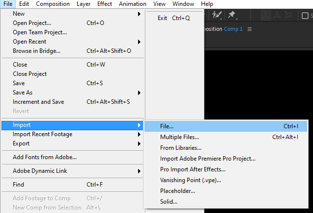
Now, import your data into After Effects. Go to “File” -> “Import” -> “File” and locate your pre-prepared data document. Ensure that the import settings are appropriate for your data format, such as CSV or Excel files.
4. Create the Graph Structure:
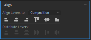
Time to start building your graph! Choose the appropriate tool, such as the Rectangle Tool or the Pen Tool, to create the foundation of your chart. After Effects makes it easy to customize the shape, size, and position of your graph elements. Utilize the alignment and distribution options to maintain consistency and precision.
![]()
5. Create and Animate Your Graph:
The true power of After Effects lies in its ability to animate your visuals. Add keyframes to your graph elements and adjust properties like position, scale, and rotation to create a dynamic and engaging presentation. Don’t be afraid to experiment with easing and motion blur settings to add flair and smoothness to your graph animations.

6. Customize Your Graph Elements:
Utilize the Shape Layers feature (shortcut: Q) to add components of your graph. Make use of the graph editor (shortcut: Shift + F3) to fine-tune the timing and animations of your elements.

7. Apply Visual Effects:
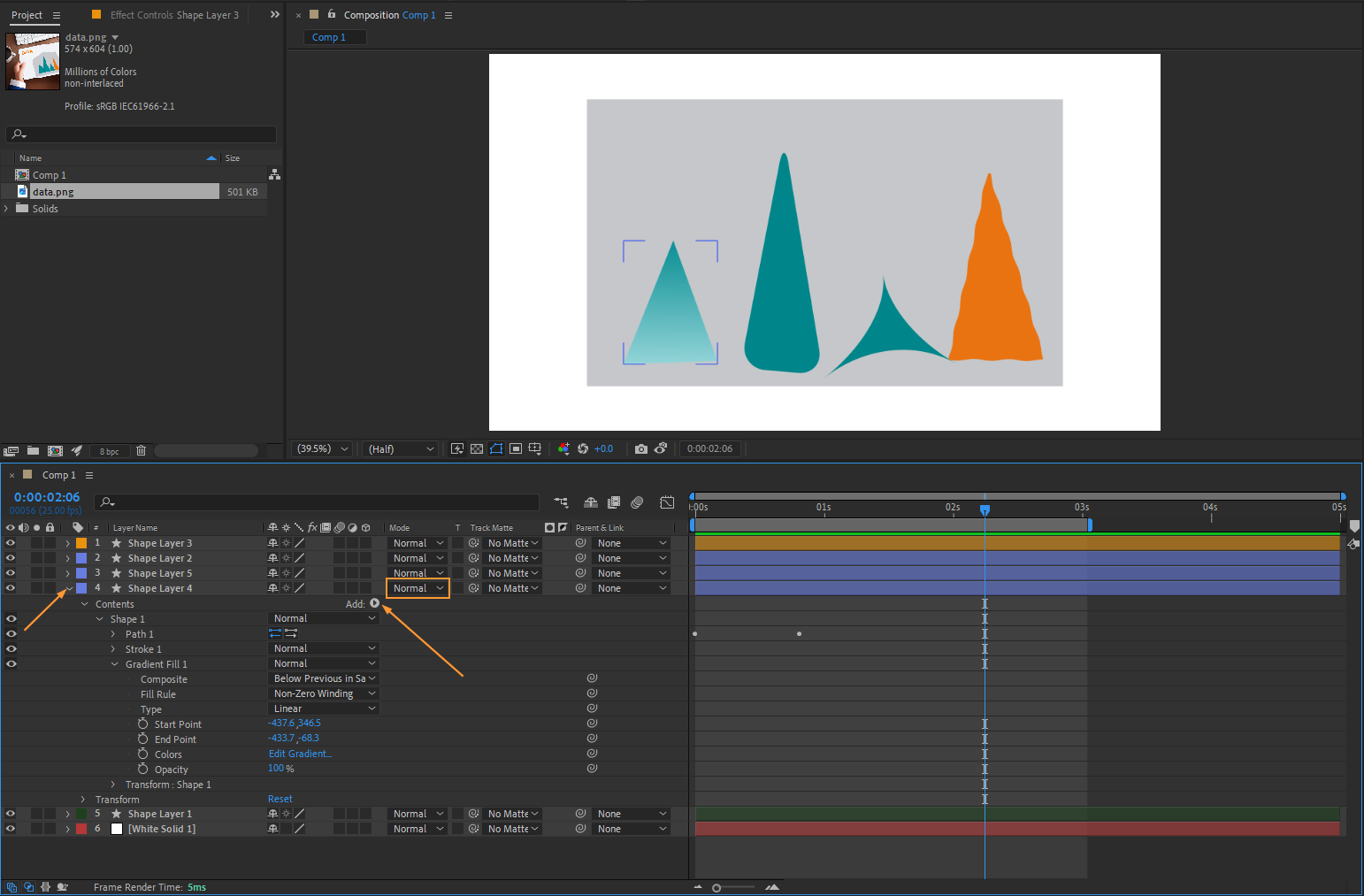
To make your graph even more visually appealing, consider applying effects to enhance its appearance. Utilize options like gradients or strokes to give your graph elements depth and dimension. Experiment with blending modes (shortcut: Shift + =) to create unique visual effects that make your graph stand out.
8. Add Text and Labels:
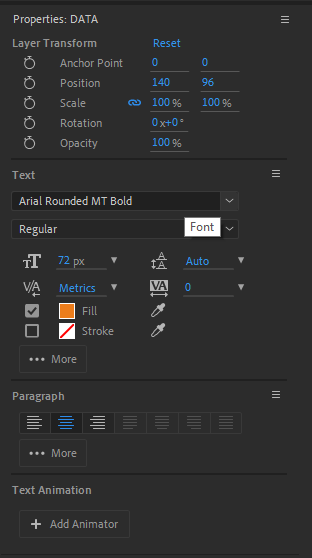
It’s important to provide context and clarity to your graph. Add text labels to ensure viewers can easily understand the data being presented. Use the Text Tool (shortcut: Ctrl + T) to insert labels, axes, and titles. Customize the font, size, and color to match the theme of your graph.
9. Polish and Fine-Tune:
Once you’re satisfied with the overall design and animation of your graph, take some time to fine-tune the details. Adjust timing, tweak the color palette, and add any additional effects or graphical elements that enhance the overall visual impact. Never underestimate the power of small details in making a graph truly memorable.
10 Render and Export:
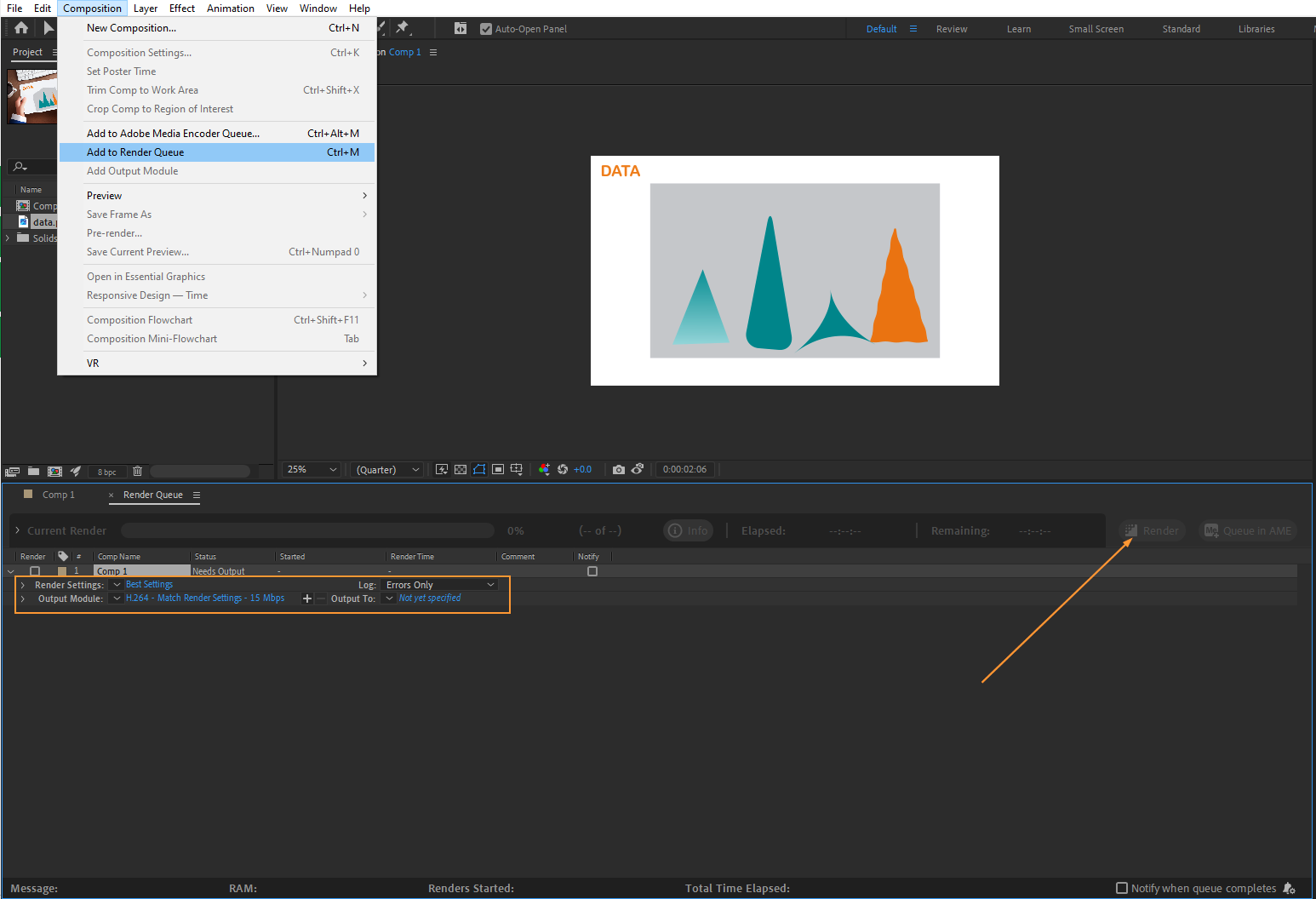
Congratulations! You’ve successfully created a stunning graph in After Effects. The final step is to render your composition and export it in a format that best suits your needs. Choose the appropriate settings, such as resolution and file format, and let After Effects work its magic.
By following these step-by-step instructions, you’ll be well on your way to mastering graph creation in After Effects. Remember, practice makes perfect, so don’t be afraid to experiment and try different techniques to bring your data to life. Happy graph-making!
Conclusion – Transforming Data into Compelling Visuals with After Effects
Creating graphs in After Effects opens up a world of possibilities for presenting data in a visually captivating and engaging manner. Throughout this step-by-step guide, we have explored the process of turning dry data into captivating visuals that grab the attention of your audience.
By utilizing After Effects’ powerful tools and features, you can design and animate graphs that not only effectively convey information but also leave a lasting impact. From organizing your data and setting up a composition to adding animations, effects, and labels, each step plays a crucial role in creating a visually stunning graph.
Remember to take advantage of After Effects’ hotkeys to work more efficiently and streamline your workflow. Whether it’s aligning your graph elements or navigating through the graph editor, using shortcuts can save you time and help you focus on the creative aspect of graph design.
As you continue to refine your skills, don’t be afraid to experiment and push the boundaries of visual storytelling. Explore different animation techniques, color palettes, and effects to create graphs that truly stand out. The more you practice, the better you will become at crafting captivating visuals that make an impact.
So, armed with the knowledge from this guide, it’s time to unleash your creativity and transform your data into compelling visuals. Whether you’re presenting to clients, colleagues, or the general public, the graphs you create in After Effects will undoubtedly elevate your data storytelling to a whole new level.
Now, go forth and graphify!

